
40 pages, black and white paperback
This isn't an abstract comic, or is it? The subject is the tension which occurs when words and images co-exist on the same page.for more information: http://www.rosaireappel.com/two-trains.html
Topic: Drawing
darryl
Member
Ironically, drawing is the aspect of comics and cartooning which I am both most attracted to, and at the same time, overlook.
I've been attracted to a broad variety of drawing styles and techniques over the past ten years, and each phase seemed like the be-all-end-all at the time (ah, youth).
adverse results to diversity; my own drawings are a total mess. They're a melting pot of influences, observation and reference, moodswings, and nonsensical pastiche.
For some, its easy. One draws and that is that. Many artists have an easy set of influences to work from. Naturalism readily springs to mind. As do popular stylizations such as Disney cartooning or manga/anime cartooning. One of my problems is that I have too many influences! I haven't fully settled with myself on what I want to be as an image-maker. I look at a tremendous amount of art, and I find myself inspired by a great deal of it. Great, but when I sit down to draw, I usually make a gigantic ugly disaster on the paper. Its because I want to be everything I've seen at the same time. When I see something that I like, I try to integrate it into my visual vocabulary, but the result is that my visual communication is a garbled, nonsense dialect.
I'm trying to strip the process of drawing down to its most basic essentials. I feel like I need to re-learn everything, inside-out, backward and foward again. Every new piece I do feels like my first drawing (its very exciting). I'm teaching myself to look at things--and really see them. Teaching myself to build drawings from the inside out, but it doesn't seem to be enough.
I think my primary problem is voice . I haven't found mine yet, and as a result, my art is very conflicted. I use "voice" rather than "style," because I think the implication of "voice" is one of more substance, and more central to the artist's personal core than his or her style which is like their surface. They're both related, but not interechangable. I find that most image-makers at my age have long since found the beginnings of their voices; they have a clear direction and mindstate and their work--consciously or unconsciously represents something very idiosyncratic about them.
The only thing I find that my art reveals about me is how much I don't know about myself and my direction.
Drawing...makes ya think.
Andrei Molotiu
Member
Stop looking at art and start looking at life. Take a sketchbook with you and force yourself to capture that person standing on the corner before the light changes and they start walking again. Sign up for a figure drawing studio, especially one that offers a lot of short poses. DON'T think about the quality of the line yet, but about the life of the figure--the line will follow. Etc etc. (I taught figure drawing for two years, so I could go on and on.)
darryl
Member
I agree with that advice, but I don't think that is exactly what I'm talking about with this particular thread. I'm not so much worried about the "hows" (I actually deleted the paragraph in my original post that would have been about the difference between the technical drawing skills I learn here in art school and the kind of stuff that I'm touching on in the thread).
However, I have been making an effort to do just what you've suggested here; I've been doing it for about four years now (learning to draw is a lifelong process, I realize). Its just that I'm trying to figure out how to put it all together when the time comes to stop sketching and make a complete image. For me, drawing is about a quarter objective techniques, a quarter observation of real things, a quarter influence, and a quarter imagination--or something along those lines.
I guess I'm sort of trying to get at a deeper concept than the surface elements and aspects of drawing; techniques, rules, practice, etc.
Think back to TCJ #243 with Dylan Horrocks, pages 52-53, subheading "Exploring Drawing." I have the tiniest tinges of idea for what I'm thinking of for this thread, and when I had these shadows of a thought, I immediately thought of this passage.
Its a weird concept, but its something I definately think about when I am drawing (I actually wanted to talk about drawing in general, but without a concrete idea of what I'm trying to express, its just easier to refer to myself).
I hope this sort of makes sense.
Andrei Molotiu
Member
Well, I just reread the Horrocks, and I think I know a little bit more what you mean. Let me begin with a bit of bibliography, while I gather my thoughts. You may want to look at:
Philip Rawson, "Drawing" (my senior thesis advisor called it "a fascist approach to drawing," but it can still provide a lot of food for thought)
I once heard an amazing talk by David Rosand, where he simply tried to describe our experience before Rembrandt's drawings--I haven't read the published text, but I think it appears in his book "Acts of Drawing" (or something like that--his most recent book)
Ok, here goes. I was trying to describe to somebody a while ago why, even though I am (also) an artist--primarily a graphic artist--and, at the same time, I write and teach about comics, I haven't actually yet combined the two. I came up with two possible, related reasons:
1) the immediacy of (the act of) drawing as fine art versus the careful planning required of drawing for comics. In comics, the graphic act itself comes only after many other creative stages, and as such essentially works as illustration. If I understand correctly, it is this exact status of cartooning-as-illustration that Dylan H. is trying to overcome...
2) closely related, the relation betweeen drawing and viewer. In a "fine art" drawing, hung on the wall, the relation is that of a direct axis between image and viewer--a relation that, metaphorically speaking, is essentially perpendicular to the plane of the drawing. In cartooning-as-illustration, the relationship is also lateral--inasmuch as each panel has to lead to the next, etc. Part of this is also the simplification usually required for a cartoon (whether by Schulz or Caniff) to work as text--ie, to convey information that will carry the story forward. In the case of drawing-as-fine-art, the relationship to the image is essentially phenomenological--you are confronted by the work in its utter singularity, and every detail, every inflection counts. In cartooning-as-illustration, the relationship is textual--you are receiving bits of information, and once all that information has been consumed (usually quite quickly), you move on to the next panel.
Dylan's question then might be, how do we infuse our "textual drawing" practice with something more akin to the phenomenological confrontation to the image in drawing-as-fine-art? I don't want to make a radical distinction between the two, but the fact is simply that, even before the most graphically complex illustrator--let's say Kirby-and-Royer, or late Alex Toth, or Hugo Pratt--you can't spend as much time as before a Jackson Pollock black-and-white piece, or even a drawing by Pierre Alechinsky or Philip Guston (to cite two who got their inspiration from comics). You'd exhaust the former pretty quickly, I'd say.
Now, the old saw that cartooning is primarily about storytelling asks exactly for that kind of easily consummable, illustration work. On the other hand, you have, perhaps at the farthest extreme, something like Gary Panter, who occasionally comes the closest I have seen anyone in comics come to B&W Pollock. However, you can have that attention to the singularity, the graphic phenomenon of the drawing--attention that would seem to go counter to the narrative impulse--even in work that is not necassarily abstract; I would see it, for example, in some of Tony Millionaire's or Crumb's work, and even in some non-Palomar Beto (which should show you this is not about "good" drawing), and it is something similar that Ware is trying to do with design.
Sorry, these were just a few thoughts sparked by the Horrocks piece--I know that they don't exactly address your question. For that I don't think there is a recipe. I remember taking a year-long drawing course, my sophomore year, with a very anal academic artist--after which, boy, I could draw everything I wanted, but I felt cramped as hell. I slowly escaped it over the next two years by studying Chinese and Japanese brush painting, and trying to capture in my own work that undeliberate immediacy of Zen art (which is perhaps why I deal so poorly with any notion of planning in the visual arts). So, all I was trying to say is that, after all this reasoning and arguing and deliberation, after all the influences and schooling, the only way to capture a "voice" is to let it come unexpectedly, and as if from the unconscious. I'm not sure if that helps.
As for the first part of this too long message, I hope that Domingos reads it--I'm sure he'd have something to say about it.
gregkelly
Member
pardon me if anything expressed here is heretical or just plain missing the point of what Darryl is asking about....
there are two immeditate, and relatively simple things, to consider first if you are trying to find your stylistic voice. Both are questions you have to answer before settling down on your style.
What manner of drawing feels most comfortable to you, techinque-wise?
What kind of stuff are you wanting to draw?
For the first question: it depends alot on the toolset you dig using the most. I'm gonna guess that you are laying down ink on paper. If so, the pen-type or brush-type is your tool and obviously if you want to improve techically with your choice then you have to work at it.
Now I realize that seems stupidly obvious but the thing is if learning how to get a line out your tool is your stumbling block then practice, practice, practice. But, you should also use other tools-- devoting a good deal of time to those styluses. Sure, doing life drawing, or observational rendering, with pencil is never a waste of time. However set some time aside to do full rendered work with just your pencils (or cheap markers or techincal pens or whatever). Be as loose with that graphite (etc.,etc.) as you need to be to get a good feel for the possibilities of the right form. Then go over it to further realize your images. And for god's sake, don't think about what you are doing. Once you start doing that you end up just as frustrated as your most challenging method poses. In short, make drawing fun. You should still find that the learning is still visible to your eyes. Plus, you can take what you discover and apply some of it to your challenging tools.
For the second question, try to consider what type of look works best for what you are doing. By this I don't meant go all over the map, stylistically. What I mean is do what works best for the work, be it subject, characters, setting, whatever. Is what you do an attempt at humorous cartoons, brow-furrowing seriousity, romance comics, adventure strips, what? You probably already know enough to figure out a dozen approaches for what you are going for but just narrow it down to a few and make something that comes close to what you "see". Hopefully, you can at least sharpen what you are going for.
Additionally, and finally, along the lines of draw spontaneously and everyone or anything that looks interesting...stop looking at comics for styles you want to emulate. Take a hiatus from looking at linework. Sure, attempted aping or using derivative stylies can seem like a great stepping stone to touch upon; natural and unavoidable as erasing. However... stepping back from the art of others and focussing on what you can put into it (kicking out your worst habits and eschewing bad influences) you'll likely figure out those things which work for your work. Sure, it still may look crude to you for a while longer but (fingers crossed) before you know it it might be darn close at something you can totally get into.
If any of this helps you, Darryl, cool. If not, mebbe someone else might find it helpful...if it makes enough sense... as I justify why I typed this (and why I used the SHIFT keys).
oh yeah, and hopefully others will chime in with their notions for your benefit or the benefit of anyone.
Domingos
Member
quote:
________________________________________
Originally posted by Andrei Molotiu:
As for the first part of this too long message, I hope that Domingos reads it--I'm sure he'd have something to say about it.
________________________________________
Apart from thinking that you wrote a great post, I've not much to add. I've never read much about drawing, really. I still think that practice is the best teacher. One book remains with me though: La pensée creatrice by Paul Klee (here's vol. 2: http://www.amazon.fr/exec/obidos/ASIN/2249250197/qid=1042040542/sr=1-7/ref=sr_1_1_7/171-1383151-8440216 ).
The best way do improve is to explore multiple paths. Sometimes this is a problem, because the possibilities are overwhelmingly huge. That's why we need to focus a bit. Greg is right when he asks: "What kind of stuff are you wanting to draw?" More than that, I would add: what aspect of that stuff do you want to explore?
I reread pages 52, 53 of Dylan's interview too. He makes a few interesting points, that's for sure. One of them I repeatedly claimed on this forum: in comics the drawings are the story too. But he goes further than that comparing the drawing with the feeling of a singer's voice. As I see these matters (and, please, correct me if I'm wrong) what Dylan and Andrei above are talking about is basically texture. Ernie Bushmiller's and Hergé's worlds are almost textureless. This is great for comics because we can go on reading the story without feeling that we missed something (it also approaches comics to abstract geometrical painting; I don't think that Hergé's taste in painting was separate from his work as an artist at all). Robert Crumb and Gary Panter, on the other hand (or Martin tom Dieck and Edmond Baudoin, for instance) are extremely sensual in their approach to drawing. We feel, not the real world, but the worlds they created for us. We inhabit them: I particularly like to lose myself in Martin tom Dieck's deep waters, Robert Crumb's entangled posts and wires, Gary Panter's toxic fog clouds, Edmond Baudoin's wavy seas and wavy women.
Domingos
Member
By the way, the English title of La pensée creatrice is The Thinking Eye.
Nick Mullins
Member
Darryl, I know exactly what you're talking about. Only recently have I gotten over worrying about this. Unfortunately, I don't know what made it go away. I think being too busy made me forget about it for now.
I agree with what Greg says at the end of his post. You can use various styles, but use only one per story. A plethora of style didn't hold Picasso back. Quite the opposite. Darryl, maybe it's taking you longer to define how it is you want to draw, but perhaps this process is making you much more supple.
Domingos makes a great point too. Drawings can add a level of texture to the story. I always thought of drawing as another vehicle for mood, but texture might be a better term. As he says, some artists are virtually textureless. What effect does Ware's neurotically clean line have compared to the work of Gary Panter? The line itself carries the story in Panter's case. For Ware, I'd argue that it's less about line and more about overall page design.
For me, the fundamental difference between fine art drawing and comics drawing is that comics drawing must be consistent from panel to panel. In fine art, you can draw something and not have to worry about reproducing that same look again. In comics, you must recreate the same facial features, style, etc. from panel to panel for reader comprehension (obviously you can defy this if you want to, but most comic artists don't). This means that you must have a certain level of control over your drawing style. This is what makes comics more like illustration. For, illustrators tend to adopt a single style (at least for a certain amount of time), because a single style is more recognizable and easier to market. But their are a few comics artists who use a more fluid style. I'm thinking of McKean in Cages. Here he has a very sketchy drawing style. And then he throws in other styles: painting, computer montage, etc. (I actually think he different styles work better in Mr. Punch though I love the drawing in Cages). Yet even with McKean the style only shifts when the scene or mood shift. So again, style is subservient to the story. It is another storytelling device.
will barnes
Member
Although I have nothing as well thought out to say as some of the other posters here, I will tell you this, Darryl, you're thinking too much. I know that sounds cliched, but I do the same thing. I fret over finding my style. I worry that I've got too many influences working for me, muddling the work. Other times I worry that me work is influenced too heavily by one artist. I curse and fuss and I lose sleep over finding my voice. The thing that helps me most though, is to simply draw. Just sit down and draw. I grab the ol' sketchbook and draw, in pen, with no plan in mind. Chances are you already have a voice. It may be weak at the moment, but it's there. I was shocked when I had someone tell me that they could recognize my style. Sure there is still room for improvement, (I feel that my work is too busy and could stand to be looser and simpler), but if I just do instead of worrying about it, it turns out so much better. But hey, maybe that's just me.
Please forgive any awkward sentences or typos, I'm at work and facing a deadline.
Andrei Molotiu
Member
Thanks, Domingos!
quote:
________________________________________
Originally posted by Domingos:
As I see these matters (and, please, correct me if I'm wrong) what Dylan and Andrei above are talking about is basically texture. Ernie Bushmiller's and Hergé's worlds are almost textureless.... Robert Crumb and Gary Panter, on the other hand (or Martin tom Dieck and Edmond Baudoin, for instance) are extremely sensual in their approach to drawing. We feel, not the real world, but the worlds they created for us. We inhabit them: I particularly like to lose myself in Martin tom Dieck's deep waters, Robert Crumb's entangled posts and wires, Gary Panter's toxic fog clouds, Edmond Baudoin's wavy seas and wavy women.
________________________________________
I don't think it's as much "texture" as "presence"--but maybe we have different definitions of "texture." I see plenty of texture in Herge, and I would say pretty much any cartoonist worth his or her salt has some texture in his art. To begin with, there really is no zero-degree, purely "textualized" (ie, semantic without any non-signifying remainder) drawing--and all but the most incompetent daily strip artists (as well as some minicomics that I've seen that shall remain nameless...) learn to use that texture to their advantage. But saying "texture" still means that the drawing style remains subservient to the verbal storytelling--it decorates, it provides a mood, it prettifies, what have you. I don't think that is what DH is talking about. Look at his long response in the middle column of p. 52--going onto page 53. Too long to quote here, but it ends with: "You look at a Matisse drawing and you're not trying to work out the story. And you don't judge the line and the graphic qualities of the drawing by saying, 'How do they add to the narrative he's trying to spin?' There's a whole different bunch of things that you're looking at."
As I see it, then, "texture" adds to the narrative, but is still subservient to it. "Presence" (maybe not the most exact term) confronts you with the image's non-, or even anti-narrative qualities. In that case, the comics (in the simpler case) could force you to pay attention to the art alone, with no consideration paid to the story. In the more complex case, the very conflict between the forward momentum of the narrative and the arresting effect of the art would be productive--but such a dialectic, if you will, is very different from the simple harmony of story and texture...
Let me just say one more thing. I don't value Tom Dieck or Baudoin quite as much as you do, Domingos--I mean, if you insist, I'll keep trying, but here's my current position on them. In both of their work I see any kind of conventional "cartooning" style (eg ligne claire) abandoned, yes, but only in favor of an illustrational style that tries to obtain some kind of cultural authority--"modernist cred," let's call it--by mimicking, and essentially watering down, earlier avant-garde fine-art styles, be they German expressionism or late School of Paris. In both cases, I feel like the art has the same quality as, say, illustrations in expensive, "artist's" editions of the 1950's. And that's not quite enough for me.
Andrei Molotiu
Member
It occurred to me that, if I drafted a list of my favorite (non-comics) draughtsmen, it might be clearer where I'm coming from. And maybe others could post theirs. So here goes:
Western:
Poussin
Fragonard
Giambattista Tiepolo
Piranesi
Goya
Seurat
Jackson Pollock (his black & white "paintings")
Eastern:
Yu-Chien (Chinese, 13th c.--the "u" in "Yu" takes an umlaut)
Mu Ch'i (Chinese, 13th c.)
Shih-t'ao, aka Tao-chi (Chinese, 17th c.)
Pa-Ta Shanjen (also transliterated Bada Shanren, Chinese, 17th c.)
Sesshu Toyo (Japanese, 15th c.)
Hakuin (Japanese, 18th c.)
Hokusai (of course...)
Domingos
Member
Andrei:
You're welcome!
Here's a definition of texture that I found on the internet (just too lazy to write my own, sorry): "texture - An element of art which refers to the surface quality or "feel" of an object, its smoothness, roughness, softness, etc. Textures may be actual or simulated. Actual textures can be felt with the fingers, while simulated textures are suggested by the way the artist has painted certain areas of a picture. Words describing textures include: flat, smooth, shiny, glossy, glittery, velvety, soft, wet, gooey, furry, sandy, leathery, prickly, abrasive, rough, furry, bumpy, corrugated, and sticky."
I don't agree with the above in one point: the "simulated" textures are textures as well, but that's me nitpicking. I also agree that I stretched the definition a bit: I included, not only the way in which a certain surface was painted (or covered with cross-hatching) but also the overall aspect of a particular section of a panel as in Robert Crumb's intricate poles and wires. I did it precisely to call the attention to the visual quality of the drawing, away from the semantic meaning (not poles and wires, but, an intricate texture - "A Short History of America" would be a perfect example to illustrate what I mean).
Now, you wrote: " saying "texture" still means that the drawing style remains subservient to the verbal storytelling--it decorates, it provides a mood, it prettifies, what have you". I can't see why this must be true (my intention was the opposite). It seems to me that what's at stake here are not any differences between the drawings, but differences in the viewers' expectations. Modernists (especially since Cézanne) wanted to avoid, as much as possible, any "literary" content. Art gallery goers following Kant's formalism did the same thing. Even in front of a highly "literary" work of art such as a Goya etching they valued the quality line, the exquisite composition, etc... Comics are a literary art form (we say comics readers, not comics viewers, even when the comics are wordless). People don't react in front of a comics panel in the same way as they react in front of a Mattisse drawing, that's for sure. But that's not caused by any specific quality, or lack of, in the comics panel.
Hergé did not a lot of textures that's why his comics style is called "ligne claire", but if I use my stretched definition of texture to him, sure, his pages have a certain texture quality. That's true. Anyway, that wasn't his intent. He wanted to tell a story in comics form and do it clearly and neatly. That's why he's deservedly admired.
Domingos
Member
quote:
________________________________________
Originally posted by Andrei Molotiu:
I don't value Tom Dieck or Baudoin quite as much as you do, Domingos--I mean, if you insist, I'll keep trying, but here's my current position on them. In both of their work I see any kind of conventional "cartooning" style (eg ligne claire) abandoned, yes, but only in favor of an illustrational style that tries to obtain some kind of cultural authority--"modernist cred," let's call it--by mimicking, and essentially watering down, earlier avant-garde fine-art styles, be they German expressionism or late School of Paris. In both cases, I feel like the art has the same quality as, say, illustrations in expensive, "artist's" editions of the 1950's. And that's not quite enough for me.
________________________________________
I'm very sorry to say this, but I don't recognize Baudoin's work and Dieck's work in the above quote, at all. Martin tom Dieck didn't abandon cartooning and certainly didn't abandon Hergé's world (read what Jan Baetens as to say about it: http://www.imageandnarrative.be/illustrations/janbaetens3.htm
This:
[image missing]
is cartooning at its best.
The "trying to obtain some kind of cultural authority" remark is especially annoying because you are judging the artists' intentions and we don't know what these are.
Baudoin owes nothing at all to the school of Paris. If you like Japanese and Chinese art so much and couldn't recognize that influence in Baudoin's art I don't know what more I have to say about this matter. The Japanese had no problem at all recognizing it because Baudoin did a book for them (Le voyage).
Andrei Molotiu
Member
Domingos--
I didn't realize you were using "texture" so literally (I was thinking more along the lines of texture, thickness, added to the entire experience of the artwork). Nevertheless, I think in that case my comments apply even more.
Dieck comes directly from George Grosz, as well as from illustration work such as that of Topor:
[image missing]
As for Baudoin, his relationship to Eastern painting is purely formal, a matter of handling the brush, if you want--a simple aestheticization of a much more complex philosophy of art. It is essentially Eastern painting as filtered through 1950's French book illustration:
[image missing]
See also [link no longer active] it's too big to post here.
I do like Dieck better than Baudoin, I must say, but in both their cases I have a hard time escaping the whiff of upper-middle-brow kitsch--exactly fitting Greenberg's definition of it (look at what Greenberg has to say about the New Yorker).
Domingos
Member
Just a quick note for now just to say that you chose your examples well if you wanted to denigrate Baudoin. He does have a kitschy side, I don't deny that (*especially* in some of the drawings that he does when he tries to capture dance movements; some of the "poetic" moments that he depicts are too saccharine for my taste too). What I find interesting in his case is that he's completely aware of that. One of his main themes is how inadequate drawing - art - is to capture the passing of time.
As for this: "I was thinking more along the lines of texture, thickness, added to the entire experience of the artwork". Well... that too... But that's a bit too vague for my taste.
That Dada story Martin tom Dieck did is just that, a story, that's all. He approached his style to that of Grosz to approach form and content. Appart from that I don't see much of Grosz in his work. Not that there's anything wrong with a Grosz influence. Being influenced by someone is not the same thing as aping his or her style.
Domingos
Member posted January 09, 2003 03:07 PM
Hmmmm, now that I have the time to post something more I don't seem to find the motivation... I refuse to accept that Baudoin is just "a simple aestheticization of a much more complex philosophy of art", that's all. He's not from Japan or China, that's for sure, but he's a lot more than an aesthete. If you want to know more about him, read this: http://www.amazon.fr/exec/obidos/ASIN/2908551314/qid=1042152084/sr=1-58/ref=sr_1_0_58/171-1383151-8440216
He wrote a book about drawing too, but it is for kids: http://www.editionsdelan2.com/article.php3?id_article=2
Finally: I still find your second post in this thread very interesting. Even if I continue to think that the main problem is in the mind of the viewer, not the work itself, you're right too. There's a more direct approach when the drawing is not mediated by a (usually poor) reproduction. Everyone who saw an exhibit of comics' original art knows that (even more so if it was by Stefano Ricci). On the other hand tipography offers new possibilities too. Maybe comics artists should explore these a lot more than they actually do. One of the things that I can't understand is why do comics artists continue to use the pen and the brush exclusively (?). There's a whole universe of possibilities out there. Just a pencil, glue, white paint, different kinds of paper textures, etc... etc... etc...
John Terhorst
Member
There is only one way to draw comics though and it was discussed masterfuly in the book "How to draw the Marvel Way" by Sal Buschima
Domingos
Member
I found this in the Genre thread, it's by Joven Kerekes and it's exactly my point: "I remember showing someone "The Playboy" once. To my disgust he read it in just a few minutes and handed it back. I said you couldn’t possibly have taken that in. He swore no he understood it all and I’m sure he did read and understand every word in the book and that’s the problem – we approach reading a comic as we do reading a book. We read every word (and then we skim the drawings as lightly as possible). In prose the room would be described and you would have to look around every inch of that room in the form of those words. In a comic you just look long enough to think, "that’s a room". You do get some impression as well but for all the trouble cartoonist go through to draw the room...
I sometimes read comics very very slowly and find it rewarding especially with a good one – one that really tries to bring you into an experience. Try it! Even to take the same amount of time looking as reading is enough to make the experience very different. You can immerse yourself that much more. (Which to me is the biggest difference between a novel and every other story telling medium such as a short story or a comic book or a film: the high immersion level)."
Visit his site: http://www.jovenk.com/
Andrei Molotiu
Member
Domingos--funny, I had thought of the same issue on the "genre" thread, and how it applies here--and, indeed, I think I was trying to say the same thing when I wrote above:
"In the more complex case, the very conflict between the forward momentum of the narrative and the arresting effect of the art would be productive--but such a dialectic, if you will, is very different from the simple harmony of story and texture..."
The "arresting effect of the art," by which I don't mean just "astonishing", but art that forces the narrative to slow down, by way of its complex texture --not just visual or graphic texture, as I was saying, but (also) something more ineffable, a certain difficulty... On this point we're in complete agreement. I also think this issue of texture/presence/whatever should be taken into account when weighing, as Joey does over on the other thread, the "heft" of a graphic novel versus that of a--what do you call it? verbal?--novel.
Let's move on from the Dieck/Baudoin thing (sorry I started it). I would like to keep discussing the more theoretical aspects of drawing that we've been investigating--and, indeed, I wish that Dylan himself would pipe up. Hello? Dylan?
Andrei Molotiu
Member
I'm going away for the weekend. Will check back in on Sunday night... Ta ta.
Hugh MacLeod
Member
Hi Andrei, long time no see...
Well, to paraphrase Saul Steinberg, all artists have their limitations... Picasso, Goya, Chris Ware, I don't care who you name.
Part of Steinberg's genius was the struggle with his limitations.
I'm trying to think of all my favorite cartoonists... say a shortlist of about a dozen... only 2- Ralph Steadman and Chris Ware- I would say had any real technical drawing abilities.
My drafting skills were always so piss-poor I never could imitate other people's styles, so I had to invent my own. To me that's a better outcome than just being another guy who can imitate Marvel or Herriman.
shane durgee
Member
In an interview, Cecily Brown talked about Goya's etchings and how the negetive spaces in his work are some of the most violent shapes in art. It made me think about drawing and composition in comics, how thoughtful composition by itself can create emotion.
Baudoin's work stunned me when I recently discovered him. I don't read French, which gives me the freedom to view the work as a series of related drawings, and interprut them without a story. His attention to the line's energy and to composition in drawing impressed me.
As an artist I think I'm at the same place Darryl is at, still trying to discover a style I'm comfortable with, that seems to be uniquely me own. I'm influenced from everything from Cezanne to manga, so coming to a compromise of styles is really difficult, but as Darryl said, very exciting.
I'd like to post more but Im at a friend's house.
Andrei Molotiu
Member
Just wanted to see if I could bump this thread back out of oblivion... Let's see.
Andrei Molotiu
Member
Hey, waddaya know? It worked. Hi Hugh!
I just thought this topic had died too early a death...
Terry Petta
Member
Thanks, Andrei. I just read the first few posts then lightly skimmed the rest; bears further reading when I can really get into it. I'm a writer-type personality as opposed to a drawer-type personality, but I have many similar issues. Right now I'm finally writing (pastiche and heavy genre to pump it through the system).
I find that Greg Kelly's advice is similar to advice which was very freeing to me: keep it fun. You can easily stifle your own creativity. Even when my own work doesn't rise to the critical standards I expect from PROFESSIONALS, I try not to forget that I am an AMATEUR, a person who is working still, from a LOVE of the form (I have a day job). You have to do some work before you can do better work. Sticking with a piece of work, even when you (your own greatest critic and editor and censor) wants to tear it to shreds, is always a great challenge.
Greg Kelly's second piece of advice, "find a style that suits the subject" is also excellent. We are all standing on the shoulders of giants. To do better than what we have already seen ("I could write a better book!"), we must not only absorb that influence, but also see its shortcomings, through honest analysis.
I found Kurt Busiek's advice on theme in TCJ to be very enlightening (Mining the Mainstream). Tell a story that YOU find interesting. Do it well, in a style suited to the work, and follow through. Submit it and move on. (Thus sayeth Sparky, too, through Tonra.)
Also, for writing, I found the highly heretical advice in "The Nasty Little Book About Writing" to be utterly depressing, and ultimately, very freeing. Authored by D.W. St. John, Poison Vine Press.
My own unedified two cents, for what it's worth. I imagine in drawing it must be that much harder, since you are actually working on paper. I find that the computer frees me up to make mistakes, and rewrite easily (although that's still the hardest part, almost like down-climbing a route), since it cleans up the mess as you go along (not that intuitively, but then I'm just using WordPad).
One of the things that let me experiment more, when I always thought that real pros just laid it on the page on their first try, was seeing how sketchy some of the pencil layouts in "How To Draw the Marvel Way". There's one spot, I think it's Medusa's hip or something, where you could see that the penciller just kept revisiting the shape until he got it right, and used that to add volume to the figure. I remember thinking "Wow! He did like forty-seven passes with the pencil until he liked it, all real sketchy, just to draw it out of his own mind without killing it." It made me realize even Big John (or whoever the penciller was, brother Sal?) had to try to get it right, too.
Even Hemingway rewrote constanly. There are those who say he did both too much and too little, but at some point, he felt the work was ready (arguably it was less so as he got older).
I should be writing. Take care.
shane durgee
Member
"Even Hemingway rewrote constanly. "
I think about Hemingway at least once a week because of this point. He was always trying to find the perfect sentence. He would write it, write it again, until he couldnt say it any clearer. He was slowly making diamonds out of coal.
There are cartoonists that work this way. Magnola comes to mind. Steve Rude of course. I think Charles Burns is that way too. But with them its about drawing, not writing. Drawing the perfect image to say what they want to say as effectively as possible, redrawing it until it can't be any better.
That work ethic is really inspiring.
Any extension of that, which is more relevant to this thread, is the actual style of drawing in itself. Reworking your visual vocabulary, replacing tools, until you have a visual language that expresses your ideas perfectly.
The way you come to this is by drawing over and over, looking at everything, letting yourself be influenced by the most unlikely things.
I also agree with "Keep it fun." I almost stopped cartoponing and tried my hand at painting again, but I had a really silly comic I wanted to get out of me, so I did it without pressure, allowing my mind to wander and my hands to experiment. I had fun, and I like the outcome.
shane durgee
Member
Sorry, Mignola (Hellboy), not Magnola.
Domingos
Member
quote:
________________________________________
Originally posted by shane durgee:
Drawing the perfect image to say what they want to say as effectively as possible, redrawing it until it can't be any better.
That work ethic is really inspiring.
________________________________________
That's not so simple. A drawing can be overdone very quickly.
Scott Grammel
Member
Domingos, you seem to have moved somewhat away from your earlier formulation that Bushmiller's art is textureless while Crumb's is textured, but you lost points for ever saying it. Smooth is a texture as well as rough. I would also suggest that anyone who can't see a fundamental difference between the simple, functional pen lines of a Herge and the obsessive, tightly-controlled sensuality in Bushmiller's brushstrokes is close to losing his critical authority. And I've got to say that your in-comics-the-drawings-are-the-story-too formulation is becoming as knee-jerk and unthoughtful (and unhelpful) as R.C. Harvey's particular formula.
shane durgee
Member
No, you're right it's not simple. Artists that can capture their voice with a few delicate lines and move on are truly gifted.
Reworking drawings until you kill them is good practice to know where that point in the drawing is.
Andrei Molotiu
Member
I keep meaning to write a longer post here, but in the meantime:
I keep seeing the word "drawer" used for someone who draws. Now, a drawer is a piece of furniture--or rather, a piece of a piece of furniture. I don't think it should be anything more. The technical term is draftsman--or draughtsman, if you're British, or if you just like better the way it looks, like I do.
Agree? Disagree?
Tim Kelly
Member
I've always loved it when people tell me I'm a good drawer. I reply, "Thank you, would you like to put your socks in my mouth?"
9 times out of 10, they do.
shane durgee
Member
Also, I dont think those examples of Baudoin denigrate him at all. They're fine examples of how expressive his lines can be.
Only Andrei's words make his work seem thin. But there's a lot there. I've never seen those two examples before and I think they're gorgeous.
Baudoin's failure is in combinging sketchy, crosshatched backdrops, with these intense, thick strokes in the foreground. It always jars me to see two completely seperate styles mixed badly.
shane durgee
Member
I also realize I didnt make a point clear in an earlier post. I mentioned the violence in Goya's negetive spaces, especially in his etchings. This was in response to something posted earlier about modernists viewing a "literary" piece of art like Goya's etchings and being concerned with things like line quality and composition.
Obviously, all these things add to the narrative, in some cases are essential to it. That point was probably already clear. I just like ranting about art.
Dylan Horrocks
Member
OK, alright, you persuaded me to post. Great discussion - and close to my heart. All very informative. I think Andrei's stuff about the dialectic between narrative (comics-drawing-as-illustration) and drawing-as-art is a part of what I struggle with - it's why my sketchbook drawings are usually much more satisfying and 'free' than my comics (with the exception of 'the Last Fox Story' which was drawn in ballpoint on scraps of paper without pencilling - and often without even knowing what panel I was drawing).
But it is a 'dialectic' - rather than a dichotomy. The relationship is complex and can be a creative tension - and the two aspects are so interwoven that it's impossible to boil it down to a simple one vs. the other thing...
But even that isn't quite it for me. My way of conceiving of the struggle I've been going through is that I'm interested in the drawing AS the story. This seems a little different to me to the idea of drawing as phenomenological. Instead, when looking through a comic, I'm exploring the way the drawing has its own story, which is entirely independent from (though sometimes parallel to) the story of the comic's superficial narrative. The drawing's story might be about struggling with the artist's limitations; it might be about trying to recreate the world - or create a new one. It might be about the uneasy relationship between line and form - clean and dirty, rough and smooth, etc. There are themes, successes, failures, drama, struggle, despair, energy, stillness, etc etc. In a comic, as opposed to a single drawing, this story is spread over pages and pages and can rise and fall, build and climax and generally form a (usually unintended) narrative all its own - one which may have nothing at all to do with the more obvious 'story' (characters, plot, etc). (Though of course, it always does have a lot to do with that story, because it's what that story is made of).
I don't know if this makes much sense. Hmm...
More prosaically, however, I can really relate to your own struggle, Darryl, because I've been going through a similar one all along on various levels. One reason I've drawn so few comics for the past few years (it's not entirely DC's fault!) is that this struggle has got pretty intense and crippling at times. In short, I'm deeply dissatisfied with my own drawing - at least as it seems to end up looking in my comics - and keep trying to find a drawing voice that feels comfortable and robust and honest.
I'm currently extremely jealous of James Kochalka's speed drawing, Chester Brown's methodical, careful, miniaturist style, Megan Kelso's pure, heartfelt simplicity and people like Roy Crane, Harold Gray and Bud Fisher. Not to mention my friend Timothy Kidd, whose latest minicomic contains such lyrical, intimate drawings... sigh...
The strategies I keep employing are based on the maxim: 'to change your art, first change your habits.' So I've tried different tools, different paper, different sizes, techniques, etc. At the moment, I feel the best approach might be to emulate Chester's technique of drawing each panel on a separate piece of paper. I'd like to give up pencilling. I'd like to draw with a ballpoint pen on newsprint.
But on the other hand, maybe I don't want to do that. Groan. Fingers crossed, I'll get there soon... ;-)
First, though, I'd better finish the latest issues of Batgirl and Hunter (ahem)...
Cheers
Dylan
[page 2]
Dylan Horrocks
Member
Oh - and just to take up a couple of other things:
One cartoonist I think is relevant to this is Lorenzo Mattotti - not his colour stuff, but the transition from work like 'Fires' to the b&w line-drawing work of the 1990s ('L'Homme a la Fenetre' and 'The Thinking Tree' and 'Stigmata' etc). In the b&w stuff, the drawing is incredibly interesting to me; the way the pen itself seems to become the main landscape being explored and struggled with. The way the drawings keep spiralling away from 'meaning' and away from 'representation' and become something more like action painting.' I think Mattotti goes much further with this than Baudoin... Though having said this, I'm excited by my first glance at Baudoin's new (huge) l'Association book (reviewed in a recent TCJ).
But my own relationship with Baudoin's work comes and goes. Sometimes he seems superficial and a bit precious to me. Other times it's very exciting. Currently, the people who I'm most drawn to are a bit more slow and obsessive than Baudoin - more Henry Darger than Matisse, if that makes any sense.
Andrei - I'm interested you include Seurat in your list. It was by looking at his drawings (rather than his paintings) while doing life-drawing classes a couple of years ago, that I realised how locked into 'linework' my drawing was. I started working with form and space for a while instead and it was a revelation.
I think 'texture' is a good work - but I also agree that Herge and Bushmiller easily have as much texture as Crumb or Gray (etc) - that clean pure clarity is incredibly evocative and complex to me. I find the same kind of texture in Kirby's clean 1960s work (Fantastic Four etc) - the way all the clothes, furniture, landscapes seem clean and tidy and neat and smooth. It all conjures a world of purity and control, which is very compelling and utopian. Barks has that too, for me - albeit with a more working class, Crumb-esque tinge. I don't know if any of this makes any sense. I still don't really know how to talk about this stuff; only that I want to talk about it and believe it's the missing aspect of comics criticism (which tends to talk about the 'story' - in a plot/character/theme sense; and discusses the drawing either in a cinematic way (how the composition and lighting affects the narrative) or as a 'style' (and its relationship to the narrative) - in short, it tends to 'judge' how well the pictures 'tell the story').
Anyway, deadlines call...
Dylan
Dylan Horrocks
Member
quote:
________________________________________
Originally posted by Dylan Horrocks:
I think 'texture' is a good work
________________________________________
I mean that it's a good 'word' of course. Damn that no edit button policy...
Kristine
Member
It's interesting that Dylan brought up Lorenzo Mattotti, as he is hands-down the artist that I most enjoyed watching DRAW.
He came to the San Diego convention a few years ago (with the good people of La Borsa del Fumetto, I think) and for some reason he wasn't mobbed by fans as he should be. I spent every lunch break at his booth, watching him draw with brush pens: gorgeous, fluid, active, smooth lines. It was like he was giving an improvised concert and almost never hitting an off note.
It was an incredible gift, so much more nourishing than convention food. It was the first (and only?) time that I found watching someone draw to be as satisfying as reading the final product.
gregkelly
Member
quote:
________________________________________
Originally posted by Andrei Molotiu:
I keep meaning to write a longer post here, but in the meantime:
I keep seeing the word "drawer" used for someone who draws. Now, a drawer is a piece of furniture--or rather, a piece of a piece of furniture. I don't think it should be anything more. The technical term is draftsman--or draughtsman, if you're British, or if you just like better the way it looks, like I do.
Agree? Disagree?
________________________________________
Ramble alert: level O Range.
and to refer to one's self as a draftsman might make a mighty fine impression on folks but does it tell them what you do? Or, would it automatically make them think you are an architect?
one of the things about explaining what type of visual art you do is that people seem to automatically grok what it is you do based upon the word you throw out. While defition usally walks in lockstep with words, not everyone is going to see the same definition.
What I mean by this, Andrei, it is easier to say what you draw than it to wrap it up in one noun. That way it is narrowed down moreso than any all inclusive word allows. While personally, I'm down with the lowly word "cartoonist" as it hints more clearly at what I make.
The word "drawer" is also alright. Why? 1)Cuz you can have fun with it verbally. {b]I'ma Drew-arrre-wer [/b]. I don't see anything wrong with that. 2)Especially since in conversation, that word leads to the question of what type of stuff do you draw.
If I only drew technical drawings or stuff that bores me, maybe the label would matter moreso, but, I (sometimes)have (alot of)fun with my drawings and i try to make funny drawings so to not approach it semi-seriously is to take it way too seriously.
Hell, I'm even down with "doodler-dude" .
next up: "texture"....
gregkelly
Member
oh yeah. what i wrote above should be put in to the context of conversational speech. I wasn't refering to the written word.
an addendum-like thing to the above post:
If i say i'm a cartoonist, i really don't want to have to talk about Dilbert or Garfield with people whom i really don't want to talk with, period.
Andrei Molotiu
Member
I wasn't talking about conversational use--though, even then I wouldn't use "drawer" (what, and have people offer to stuff socks in my mouth?). I am not a cartoonist (at least not yet, though I am trying to finish my Shiot Crock pieces); technically, I guess I could call myself a draftsman (I have an undergrad degree in studio arts, with a "graphic arts" concentration, and a senior thesis that was all drawing, so that makes it official; I have sold a number of drawings, and taught figure drawing for two years), but I do not use the term to describe myself. I don't even use it as an occupation, but as a skill, just as when I say that my wife is a great baker I don't mean that that's her job (she's an archaeologist) but that she makes some damn tasty pies and cakes.
I guess what annoyed me was to hear people call someone an excellent "drawer." No. Fragonard, for example, was a great draughtsman. Claude had excellent draughtsmanship. I would like to teach a class on draughtsmanship sometime, because most art history students tend to look immediately for the subject matter of an artwork, and rarely pay attention to how the artist's chalk or reed pen gave shape to the figures, how three strokes here define the biceps, how a patch of cross-hatching suggests a silhouette emerging from the darkness. It's only by knowing something about draughtsmanship that you can tell an actual Raphael drawing from one by one of his followers, or from a modern fake by Eric Hebborn.
Take Tony Millionaire. Tony is a cartoonist, yes; but just saying that he's a good cartoonist doesn't explain whether I think that he writes good jokes, or that his strips have excellent comedic timing, or that he draws well. When I refer to his drawing abilities, I speak of him as a draughtsman, and an excellent one at that. I don't speak of him as drawer. (Though he, of course, may call himself whatever he pleases...)
Sorry for talking this into the ground.
Andrei Molotiu
Member
Come to think of it, sorry for sounding like such a goddamn word nazi. I seem to have been doing that a lot lately.
Andrei Molotiu
Member
quote:
________________________________________
Originally posted by Dylan Horrocks:
My way of conceiving of the struggle I've been going through is that I'm interested in the drawing AS the story. This seems a little different to me to the idea of drawing as phenomenological. Instead, when looking through a comic, I'm exploring the way the drawing has its own story, which is entirely independent from (though sometimes parallel to) the story of the comic's superficial narrative. The drawing's story might be about struggling with the artist's limitations; it might be about trying to recreate the world - or create a new one. It might be about the uneasy relationship between line and form - clean and dirty, rough and smooth, etc. There are themes, successes, failures, drama, struggle, despair, energy, stillness, etc etc. In a comic, as opposed to a single drawing, this story is spread over pages and pages and can rise and fall, build and climax and generally form a (usually unintended) narrative all its own - one which may have nothing at all to do with the more obvious 'story' (characters, plot, etc). (Though of course, it always does have a lot to do with that story, because it's what that story is made of).
________________________________________
You say: "usually unintended." Can you think of an example where such an additional "narrative" is clearly intended?
This thread, to me, seems to go hand in hand with the "alternatives to the graphic novel" one. Because, it seems to me, what you are describing is close to something that happens in poetry, where the music of words can tell a different story than the words themselves. In that other thread I mentioned Mallarme. He once described the beauty of poetry as residing in that music of words, but poetry requiring a "couche suffisante d'intelligibilite"--a sufficient layer of meaning--to appear to say something, so that poets don't get run out of town for seeming to be incomprehensible.
I should say I was a bit disingenuous at the beginning of this thread: I have been, on and off for the last year or so, for the first time in ten years, trying to draw cartoons; I'll have some stuff in Shiot Crock. Some of them have more conventional narratives (which is to say, the same character reappears in more than one panel), but in other pieces, I have tried simply to rearrange my drawing style into a comic-book format; for example, I often draw imaginary landscapes, and I tried putting six of them on a page, in a 2 x 3 grid. That specific piece, and a couple more like it, are perhaps my favorite thing I've done in this format, but when I've shown them to people they have met with uncomprehending stares... Nevertheless, I do think they have a narrative--as you say, in the drawing itself.
quote:
________________________________________
Currently, the people who I'm most drawn to are a bit more slow and obsessive than Baudoin - more Henry Darger than Matisse, if that makes any sense.
Andrei - I'm interested you include Seurat in your list. It was by looking at his drawings (rather than his paintings) while doing life-drawing classes a couple of years ago, that I realised how locked into 'linework' my drawing was. I started working with form and space for a while instead and it was a revelation.
________________________________________
There is a madness at work in Matisse's drawing--look at his line drawings of the '30's--that, if you stop and look at it for long enough, is a million times more terrifying than Darger's.
I probably could say the same about Seurat. First of all, the key to Seurat is the materials: Conte crayon (not too soft) and Ingres paper. If you pick them up, and try to draw by trailing your crayon so lightly over the paper that it does not leave an inflected trace (no obvious harder, darker beginning to the line), then put another one by its side, then another, so that each individual trace--each individual marker of a hand movement disappears, and you just have areas of dark--then I think you begin to get Seurat. By doing so, to a large extent you mask or eclipse the subjectivity of the artist (no obvious, furious strokes like in Van Gogh)--and, indeed, I'd say Seurat first discovered this in drawing before moving on to develop pointilism, which does much of the same thing in painting. The question is--can this be accomplished in comics? (Well, to some extent Renee French does it, especially in her recent "The Taint"). But can it be done with ink on paper?
A few more questions--comics has been so focused on "inking"--that is to say, on the clear separation of the surface of the paper into perfectly white and perfectly dark tones. This is, of course, also true even when you use hatching or screen tones, and to a large extent constitutes a very clear aesthetic, that people hold on to even when, due to scanning & computers, you don't need to anyomore. And clearly it is a result of printing needs. But what signification does this pure b&w separation have for narrative? What do we gain by it? What do we lose by not having more shades of gray--more areas of fading off and inflection, etc? It strikes me that, by having this pure light/dark dichotomy, we introduce a quantification into drawing that is closer to language, to letters, than the sliding scale of grays that is available in fine-art drawing. It--well, now I'm stating the obvious--is part of the simplification to which drawing has to be subjected in order to carry a story. But do we really need such simplification anymore? And does it have to be that kind of simplification?
quote:
________________________________________
I still don't really know how to talk about this stuff; only that I want to talk about it and believe it's the missing aspect of comics criticism (which tends to talk about the 'story' - in a plot/character/theme sense; and discusses the drawing either in a cinematic way (how the composition and lighting affects the narrative) or as a 'style' (and its relationship to the narrative) - in short, it tends to 'judge' how well the pictures 'tell the story').
________________________________________
Yes, that's what I was trying to say before, when criticizing to some extent the term "texture"--it exists in every kind of drawing, as you also point out, but the term seems to be usually used to explain how the drawing provides an atmosphere, a mood for the story--it's still subservient to the plot.
Gotta go sleep, just one more quick observation. You say at some point, "it's not a dichotomy, it's a dialectic." Yes, but if you take dialectic very broadly. Sometimes there seems to be an irresolvable conflict between words and images, between the drawing and the story--at this moment, for some reason Matt Brinkman comes to mind--and, even though they are clearly united inasmuch as part of the same artwork, that unity is not the smooth unity of a synthesis, but a barely-contained, unresolved conflict--which is not what philosophers usually mean by "dialectic." Many comics where such conflict appears are the ones I value the most at this moment. I'm not going to give any other examples at this moment, because it would take too long to explain why I feel this about them.
Good night.
Jerome Lantz
Member
quote:
________________________________________
Originally posted by Andrei Molotiu:
[A few more questions--comics has been so focused on "inking"--that is to say, on the clear separation of the surface of the paper into perfectly white and perfectly dark tones. This is, of course, also true even when you use hatching or screen tones, and to a large extent constitutes a very clear aesthetic, that people hold on to even when, due to scanning & computers, you don't need to anyomore. And clearly it is a result of printing needs. But what signification does this pure b&w separation have for narrative? What do we gain by it? What do we lose by not having more shades of gray--more areas of fading off and inflection, etc? It strikes me that, by having this pure light/dark dichotomy, we introduce a quantification into drawing that is closer to language, to letters, than the sliding scale of grays that is available in fine-art drawing. It--well, now I'm stating the obvious--is part of the simplification to which drawing has to be subjected in order to carry a story. But do we really need such simplification anymore? And does it have to be that kind of simplification?
________________________________________
Ok, so it's time for my theory then !
It is very intersting to get to the point that drawing uses lines that we call "cerné" in French, which means that the line is outside the form.
I'm speaking of course of the "wrapping" line for an overall figure, not those interior lines.
You can watch this quite clearly with the drawings of Geoff Darrow for instance, who uses different thickness for this "exterior" line to create effects of distance.
(sorry for the struggling english)
More interestingly, this "cerné" has the effect of defining the integrity of the subject, and even more, to precise its separation from the outside.
(btw that's which is why I think drawing is a thing of the mind : you make the decision to separate things, you cut).
Once you start watching this exterior line as symbolizing separation, then you can start using it, conveying sense through drawing style choices.
After all, the distance between you and your surroundings is as much spiritual as it is physical ; you can therefore represent states of minds (for instance) through alterations of the lines.
That's precisely where Baudoin struck me with "Le Voyage" : not only does he draw "open heads" to represent his main character, but he also draws what's inside it.
On the opposite, some of Mignola's strength lies in the blending of his characters in the surroundings through those large black areas ; separation disappears to have characters be an integral part of that gothic world of his.
It is a strength because that's exactly the mood his story needs as support.
And of course you could imagine not using such lines at all, making separation fade.
But that would carry meaning that needs to be assessed before getting into that (all the more as it seems to me to make reading more confused ; well at times you just want the reader to be confused so...)
That's one of the points that's unique to comics, so very interesting when pushing the form.
"The medium is the message", they say.
Andrei Molotiu
Member
quote:
________________________________________
Originally posted by Jerome Lantz:
More interestingly, this "cerné" has the effect of defining the integrity of the subject, and even more, to precise its separation from the outside.
(btw that's which is why I think drawing is a thing of the mind : you make the decision to separate things, you cut).....
And of course you could imagine not using such lines at all, making separation fade.
But that would carry meaning that needs to be assessed before getting into that (all the more as it seems to me to make reading more confused ; well at times you just want the reader to be confused so...)
________________________________________
Jerome--I just have time for a couple of quick notes--
the theory in the first paragraph above is actually well established--from the French Academy in the late 17th c., Lebrun and Felibien, basing themselves on Descartes ("dessin" is "spirituel," is of the mind, color is just material)
the second passage reminds me of traditional "linear" vs. "painterly" discussions in art history--going back to Wolfflin, but also to Roger de Piles (the French art critic of late 17th-early 18th c.)
Andrei Molotiu
Member
quote:
________________________________________
traditional "linear" vs. "painterly" discussions in art history--going back to Wolfflin
________________________________________
Here's a brief summary: http://www.columbia.edu/~eer1/wolfflin.html
Jerome Lantz
Member
Thanks for the link, Andrei.
Maybe I'll be able to make up for my utter lack of theoretical background some day !
My point was that those styles clearly have narrative possibilities that are unique to the medium.
Therefore interesting to dig, in order to explore the whole potential of comics.
gregkelly
Member
quote:
________________________________________
Originally posted by Andrei Molotiu:
Come to think of it, sorry for sounding like such a goddamn word nazi. I seem to have been doing that a lot lately.
________________________________________
ach!
don't sweat it. i can be be pretty petty about allowing language to breath. but then i'm of the grammatical descriptivist school as opposed to the prescriptivist one.
that writ... comics and drawing for comics.
the initial inquiry which Darryl laid out is what i thought this thread was about. it seems as if there is too much concentration on the end result instead of what goes into getting it from point A, the noggin, to point B, the page. That is sort of what I thought D's problem was about.
Which makes me wonder what the heck he is trying to draw and how the stumbling block is tripping him up. That said: been there, yada yada.
But just focusing on an end result, final product, making it as good as what you buy is likely a cause for consternation, don'tcha think?
here goes something:
Thurston Moore of Sonic Youth said something along the lines of once the music leaves your head it has already been compromised.
The idea and the image that a art-making person has must go through a filter that pretty much relies on their abilities. While it isn't entirely dependent upon just their ability, that is a crux of the problem when things aren't going well with the ability to render ideas and images.
Now, the drawings are most likely not going to be exactly like the idealized form in the head. But, through some miracle of left-brained thinking, the picture maker has to figure out what is the best way to interpert it.
With comics, I've just come to think that the narrative that arises from that boiling down of the perfect idea into something that is well-served in the form of a story (especially if it is one person doing the whole shebang)is pretty much dependent upon being comfortable with the translation of those thoughts. It is also completely relative. But, then I can't imagine that a person who is uncomfortable with making their style would tell any story well, in comics form. However, when you do figure out your own personal best practices-- for the lack of a better phrase-- you'll figure out how to incorporate more of that perfect ideal into the work.
While some folks can get away with presenting marvelously simple work, almost deceptively simple, that obviously isn't what most comics artists seem to strive for. That's sort of is where the texture comes in.
if i'm understanding the uses in the prior posts, i can't help but think composition plays a larger role in texture than does just the final "look", or style.
I look at the Dieck examples and I can tell that he has figured out the best practices for delivering information, realizing the idea. (let's face it, i'd be a moron for saying otherwise)
The texture and the overall narrative structure is seemingly dependent upon how to be comfortable with the artistic voice that you have. It is a by-product of style. The end result of the work created, unless you think too much about what you are doing, should be a faithful distillation of those ideas. it may look nothing like what you had in mind, but hey!, hopefully it is representative of what you had in mind.
That's yet another cool thing about comics, too. There are so many different takes on storytelling methods that to think there is one catch-all approach is kinda futile. Because it seems once one is comfortable with their style (which will hopefully continue to evolve) then they will discover how to use enhance their dialect of comics as they practice making funnybook stuff.
doing the uncoventional methods of producing a comic, like, one panel per piece of paper, sounds like great, but it sounds too advanced if you don't feel comfortable with the drawings you've done previously. But, using those types of methods to just figure out your drawing (not comics storytelling, just drawing) would be a good thing. Personally, if i come to a point where i feel like the drawing is deadending, I step away from it for a day and look at it again with fresh eyes, turning it upside down. if it holds up while it is upside down, then something is alright about it, if it doesn't, it is fucked.
whatever, eh?
Like I said, I'm a descriptivist. idiosyncratic as all get out. and, down with colloquialisms. sooo, i'm just hoping what i wrote makes a some sense.
Dylan Horrocks
Member
Thanks Jerome and Andrei - that stuff about the line as separation etc was gold!
zack soto
Member
quote:
________________________________________
Originally posted by gregkelly:
doing the uncoventional methods of producing a comic, like, one panel per piece of paper, sounds like great, but it sounds too advanced if you don't feel comfortable with the drawings you've done previously. But, using those types of methods to just figure out your drawing (not comics storytelling, just drawing) would be a good thing.
________________________________________
I know when Sammy H. was working on " Though I slumber, my heart is still awake" for the last SG12 , he worked this way, with the intent of having the images be one per page. He said it really opened up his creative process. Of course, I had to reformat it for the book, because I couldn't spare 20-something pages, but I tried to remain faithful to the pacing of the story, and i think the difference between the one panel per page version and the studygroup edition is interesting. How does the pacing affect the story, etc.? Sammy's done other stories like this since then, most recently his "poor sailor" which is very affecting, and is a 120+ page story, but with single images per page. How will this change (or not) for the final full color edition in Kramer's Ergot #4, which I can only assume will be in a different format/pacing.


shane durgee
posted June 07, 2004 09:27 AM
... if the admins lock down this thread we'll finally know what is and isnt comics.
ben fisher
posted June 08, 2004 04:59 AM
It makes me happy to know that other people make comics like this.
Andrei Molotiu
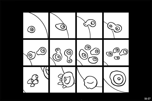
posted June 07, 2004 02:03 PM
...
Patrick--I don't know about "story," but I intended a certain "sequence" just by having some of the forms move down and to the right, others seem to progress from panel to panel, and finally establishing a certain rhythm of recuring motifs through color. I also meant to have it seem to play with things like layout (suggesting a regular 3x4 grid, then breaking it), but doing it kind of vaguely.
I don't really know if you can get what it's "about" if you squint, but squinting I'd say helps when looking at other, more straight narrative comics: I've always been fascinated by the formal, abstract rhythms that underlie them, and that still remain fascinating even after you know the stories by heart.
Andrei Molotiu
posted June 08, 2004 12:23 AM
I'm not sure I feel like explaining my work if it's not clear at first, but since I was asked here are a few replies. Please understand that I was working more viscerally (to borrow a term from Jerrold) than conceptually, so what you will read below may be secondary elaboration.
I have always been fascinated by the tension, in some of the best comics (from Little Nemo to Panter) between the reading of a comics page as a l-to-r, top-to-bottom series of panels, and the reading of the layout as a single composition. To some extent, that tension was what I was attempting to regain here. The image was from the beginning designed as a 3x4 grid of abstract shapes; I later softened the bordering lines in photoshop, united some of the shapes, etc, but I think the separation into the twelve panels is still clearly visible. I did not want to put more distinct border frames in, as that would have worked against the sense of morphing I was going for. I was not necessarily working with a planned sequence (a to b to c) as I was designing the whole page, but with definitely a sense of sequence and motion from panel to panel. Let me call that sense "sequential energy." I have been making abstract paintings since art school. In the same way that when working on an abstract composition you work with shape, but without the representational meaning of that shape, so here too, I was working with shape plus sequence, or rather "sequential energy," but without a representational meaning for either those shapes or a "narrative" (as in "story," "plot") meaning for that sequential energy.
For me, as I was designing it, the first two rows clearly had a traditional 1-2-3 (next row) 4-5-6 sequence. Then I united panels 7 and 10, 9 and 12, etc, to some extent to make that sense of sequential energy more complex. In panels 1-6, at least, color is designed to enhance the sense of sequence. (And I should say, of course it's not fully abstract: for example, I thought of panel 1 as light entering a cave where the rest of the events are taking place. This, I want to stress, is not "the meaning" of the page, just an image I had as I was drawing it.)
Comics do not always go l-to-r, top-to-bottom--I can point out a zillion examples, from Krazy Kat to Zap-era Crumb to Moebius to Chris Ware. So I welcome the possibility that there is more than one sequential thrust in the image. The reason that James starts at the bottom left, I believe, is that he's grasping onto the most representational element in the image, and starting from there. If such a double (at least) possibility of reading makes it not a comic for you, James, I would say that, a) you are ignoring a lot of comics where such possibilities exist, and b) that your definition of comics, or of sequential art, is too narrow.
Also, for me it is a piece of sequential art, rather than an abstract single image--and I know this is not an argument--because of how I usually function when making both. It felt like I was designing a sequence, not a unified field. (I wanted to show you an actual abstract painting of mine now, for comparison, but I don't seem to be able to get through to photobucket.com. I hope others of you can, or else you cannot see this image, and this entire discussion is moot.)
Once again, I don't think I thought conceptually of most of the things I said above when making the image. I was just making it and stopped when it looked cool.
...
I should add that I agree with everything Jerrold said here. Thanks!
James Kochalka
posted June 07, 2004 03:07 PM
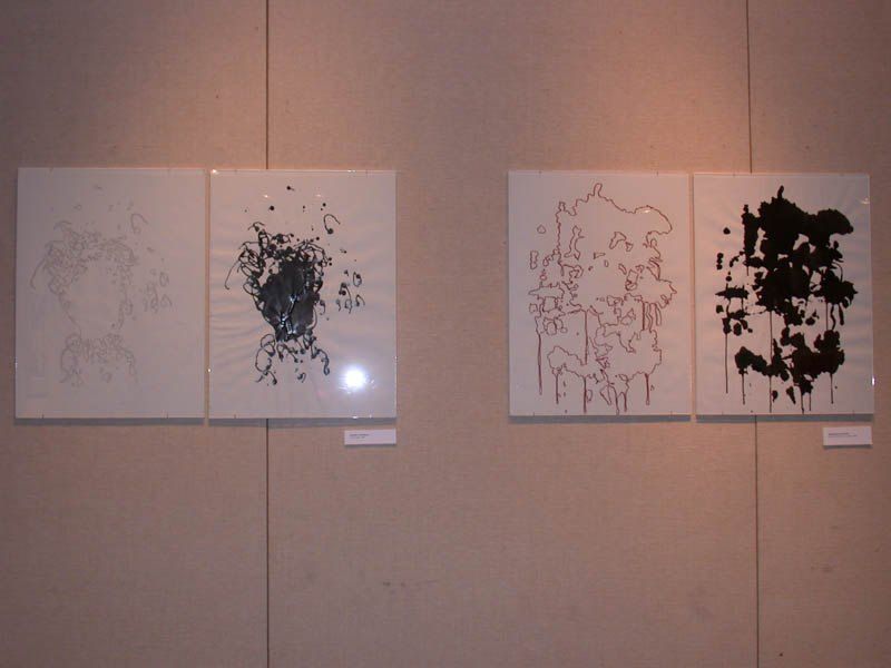
Regarding the first image in this thread, I think it would be difficult to get most viewers to read that as a sequence of images. It reads a lot easier as one single image, that's for sure.
Jerrold Shiroma
posted June 07, 2004 03:14 PM
Originally posted by James Kochalka:
Regarding the first image in this thread, I think it would be difficult to get most viewers to read that as a sequence of images. It reads a lot easier as one single image, that's for sure.
________________________________________
I think there are clear delineations in where one image 'morphs' into the next. So while it can be viewed singly, I see no problem in reading it as a sequence.
James Kochalka
posted June 07, 2004 04:14 PM
quote:
________________________________________
Originally posted by Jerrold Shiroma:
I think there are clear delineations in where one image 'morphs' into the next. So while it can be viewed singly, I see no problem in reading it as a sequence.
________________________________________
But there's no way to determine which order the sequence should go in. The areas all morph in multiple directions at once, which, with no real narrative thrust, reinforces the "single-image" reading. After all, most abstract paintings have a lot of transitions from area to area in 'em, but still read as a single image.
I'm not saying that you can't read it as a comic, just that it's easier to read it as a single image. (...a relatively complex single image.)
Jerrold Shiroma
posted June 07, 2004 04:16 PM
quote:
________________________________________
Originally posted by James Kochalka:
But there's no way to determine which order the sequence should go in. The areas all morph in multiple directions at once, which, with no real narrative thrust, reinforces the "single-image" reading. After all, most abstract paintings have a lot of transitions from area to area in 'em, but still read as a single image.
I'm not saying that you can't read it as a comic, just that it's easier to read it as a single image. (...a relatively complex single image.)
________________________________________
Under what standards of 'narration', tho?
James Kochalka
posted June 07, 2004 04:30 PM
quote:
________________________________________
Originally posted by Jerrold Shiroma:
Under what standards of 'narration', tho?
________________________________________
What I mean by "no narrative thrust" is that there is nothing which shows you which direction to read in.
For instance, if I were to follow the morphing areas, I'd read it like this:
...with several detours along the way. But you could just as easily read it in some other order, or in no order whatsoever. The fact that there is no signifier telling you what direction to read in, or even that you should "read" in any particular direction at all, reinforces the feeling that it should be veiwed as a single image.
Perhaps I'm not saying that it's not a comic, just that it's a bad one.
James Kochalka
posted June 07, 2004 04:36 PM
quote:
________________________________________
Originally posted by James Kochalka:
The fact that there is no signifier telling you what direction to read in, or even that you should "read" in any particular direction at all, reinforces the feeling that it should be veiwed as a single image.
________________________________________
That's not quite what I meant to say. Remove the word "particular" from my above quote.
Jerrold Shiroma
posted June 07, 2004 05:27 PM
Still, you're working with a rather limited view of narration. Perhaps the 'narrative thrust' is precisely in the visual presentation of the piece. Or, better put, given the abstraction of the visual, perhaps think about the abstraction of narrative. Point A to Point B might not be what kind of 'narrative' is at work here. It could be that narrative is in this sense, as Gertrude Stein would have it, simply the act of telling.
& just because the 'narrative thrust' isn't explicit, does that automatically suggest that it doesn't exist? Perhaps the multiplicity in which the image operates points to a multiplicitous reading.
James Kochalka
posted June 07, 2004 07:05 PM
quote:
________________________________________
Originally posted by Jerrold Shiroma:
Still, you're working with a rather limited view of narration. Perhaps the 'narrative thrust' is precisely in the visual presentation of the piece. Or, better put, given the abstraction of the visual, perhaps think about the abstraction of narrative. Point A to Point B might not be what kind of 'narrative' is at work here. It could be that narrative is in this sense, as Gertrude Stein would have it, simply the act of telling.
& just because the 'narrative thrust' isn't explicit, does that automatically suggest that it doesn't exist? Perhaps the multiplicity in which the image operates points to a multiplicitous reading.
________________________________________
It points even stronger to no reading at all. (And your defintion of "narrative" above can be applied just as easily to all non-objective or abstract art regardless of whether they're comics or not, so it's not very useful to this discussion.) Forget the word narrative. Basically, the "reading" I described of the peice is just my eye following the composition, just as your eye might follow the composition within any individual painting.
If we're going to say that observing the composition in an abstract painting, and allowing your eye to be drawn around by it, is comics now, I think we're entering the realm of the absurd.
Jerrold Shiroma
posted June 07, 2004 07:15 PM
I'm pretty sure, since in one of my original posts, that I see a clear delineation, that what I posted about narrative (or call it reading, whatever you'd like), clearly states that I'm looking at this piece (& my thoughts about 'reading' the picture) within the context of comics. Even then, what function do you see 'reading' serving? The revlation of some sort of plot? Story? Floating signifiers gravitating around some kind of conceptual center?
Not, really, that I would see any problem with that, unless comics are, in some way, supposed to exist conceptually, formally, theoretically, what have you, apart from everything else.
Jerrold Shiroma
posted June 07, 2004 07:21 PM
[damn no edit function]
I'm pretty sure, since in one of my original posts, that I see a clear delineation, that what I posted about narrative (or call it reading, whatever you'd like), clearly states that I'm looking at this piece (& my thoughts about 'reading' the picture) within the context of comics. Even then, what function do you see 'reading' serving? The revlation of some sort of plot? Story? Floating signifiers gravitating around some kind of conceptual center?
[so pretty much strike the last paragraph of the previous post]
James Kochalka
posted June 07, 2004 07:58 PM
quote:
________________________________________
Originally posted by Jerrold Shiroma:
[Even then, what function do you see 'reading' serving? The revlation of some sort of plot? Story? Floating signifiers gravitating around some kind of conceptual center?
________________________________________
Why in the world would you think that's what I mean by reading? We're talking about a non-objective comic here, I don't see what sort of plot or story you'd think I'd be looking for. In this context, all that I mean by "reading" is following images in some sort of sequence. On which level I think this "comic-strip" functions no better than your average non-objective peice of art which makes no claim to be a comic strip. I like it, though.
Jerrold Shiroma
posted June 07, 2004 08:14 PM
quote:
________________________________________
Originally posted by James Kochalka:
Why in the world would you think that's what I mean by reading? We're talking about a non-objective comic here, I don't see what sort of plot or story you'd think I'd be looking for. In this context, all that I mean by "reading" is following images in some sort of sequence. On which level I think this "comic-strip" functions no better than your average non-objective peice of art which makes no claim to be a comic strip. I like it, though.
________________________________________
Did I suggest that that's what you meant by reading? I was asking an honest question, since you didn't offer what you meant by 'narrative'. I was just trying to get a handle on what you're getting at. Especially given that most definitions of comics around these parts tend to favor (reductively, I know) 1) sequentiality 2) clarity of narrative within that sequentiality & 3) some kind of clear figural representation.
What's different with this piece, tho, is that it claims to be a comic strip, yet eschews the last two. Does that mean that it isn't a comic? or does it mean that, perhaps, the definitions of comics floating about are restrictive & need to be rethought?
James Kochalka
posted June 08, 2004 07:34 AM
________________________________________
quote:
________________________________________
Originally posted by Jerrold Shiroma:
Did I suggest that that's what you meant by reading?
________________________________________
By asking if that's what I meant you implied that that's what I could have meant. So, yes, you did "suggest" it. No biggie, though.
quote:
________________________________________
Originally posted by Andrei Molotiu:
The reason that James starts at the bottom left, I believe, is that he's grasping onto the most representational element in the image, and starting from there.
________________________________________
I think I started there because there's so much black there, the most contrast, and because it's the biggest shape. But yes, it does look like a little man, too.
quote:
________________________________________
Originally posted by Andrei Molotiu:
If such a double (at least) possibility of reading makes it not a comic for you, James, I would say that, a) you are ignoring a lot of comics where such possibilities exist, and b) that your definition of comics, or of sequential art, is too narrow.
________________________________________
I didn't say it wasn't a comic, I merely said this comic doesn't do anything that most non-objective painting doesn't also do. They almost all can be "read" area to area, if one wishes. In fact, with the huge prevalance of the grid in modern painting, this dividing up the image into smaller areas is incredibly common. It is pretty much the norm.
quote:
________________________________________
Originally posted by James Kochalka:
Perhaps I'm not saying that it's not a comic, just that it's a bad one.
________________________________________
I'm actually starting to think it's a pretty good comic. In fact, I think it's one of the best I've read it a while.


